> For the complete documentation index, see [llms.txt](https://wpmaps-docs.mapster.me/llms.txt). Markdown versions of documentation pages are available by appending `.md` to page URLs; this page is available as [Markdown](https://wpmaps-docs.mapster.me/mapster-wp-maps-v2/the-mapmaker/controls.md).
# Controls
Add search, navigation, and utility tools to your map.
Controls are the interactive tools layered on top of your map — search boxes, zoom buttons, filters, download links, and more. Add and configure them from the **Controls** section of the left panel, under **Tools & Controls**. Click any control in the list to open its settings in the right panel; a checkmark shows which ones are currently enabled.
> **Looking for the attribution text or provider logo?** Those live in [Map Settings](/mapster-wp-maps-v2/the-mapmaker/map-settings.md#attribution--logo), not here.
Almost every control has a **Tool Position** setting that places it in one of the map's four corners (Top Right, Top Left, Bottom Right, Bottom Left) — this is called out once here rather than repeated for each control below.
Some controls and options are limited to specific map providers or require Mapster Pro. Where that's the case, it's marked with a tag like Pro or Mapbox only. The Mapmaker interface shows the same information live as a small badge next to the relevant field.
## Search & Discovery
Six controls help visitors find, filter, and navigate to features, and they overlap in purpose. The quick distinction:
* **Address Search** — looks up a real-world address, independent of your map's features.
* **Custom Search** — searches your own feature titles and popup content (optionally blended with address search).
* **Filterable List** — a minimal dropdown of every feature; pick one to zoom to it.
* **Map Items List** — a full list or sidebar of features, with sorting, images, category grouping, and a Store Locator mode.
* **Category Filter** — shows or hides groups of features by category. It doesn't list or search individual features.
* **Directions** — looks up a route between two addresses, rather than a single location.
### Address Search Mapbox, Google Maps
Adds a search box that lets visitors look up real-world addresses and zoom to them. On Mapbox, this requires a Mapbox access token configured for your map. On Google Maps, it uses Google's own Places Autocomplete and needs no extra token. Not available on MapLibre.
* **Tool Position**
* **Default Text** — placeholder shown in the search input before the user types.
* **Accept Coordinates** Pro, Mapbox only — lets users type a longitude/latitude pair directly to jump to that point.
* **Limit by Area** Mapbox only — restricts results to a bounding box you define with NE/SW corner coordinates.
* **Limit by Country** — restricts results to one or more countries, picked from a country list (ISO 3166-1 alpha-2 codes under the hood).
### Directions Mapbox only
Adds a routing interface where visitors enter a start and end point to get turn-by-turn directions. Requires a Mapbox access token; not available on MapLibre or Google Maps.
* **Tool Position**
* **Default Text** — placeholder text for the starting-location input.
* **Directions Type** — Driving Traffic, Driving, Walking, or Cycling.
* **Units** — Imperial (miles) or Metric (kilometres).
### Custom Search
Gives visitors a search box that searches through your feature titles and popup text, returning clickable results that zoom to the matched feature.
* **Tool Position**
* **Search Type** — Exact Match (the default) finds the exact phrase. Any Terms and All Terms Pro match on individual words instead.
* **Number of Results** Pro — maximum results shown in the dropdown.
* **Include Address Search** — merges real-world address lookup into the same box; your own features always appear first in the results.
* **Limit by Countries** Mapbox, Google Maps — restricts the address-search portion to selected countries. Only applies when Include Address Search is on.
* **Render in External Container** Pro — renders the search box into a `
` elsewhere on your page instead of on the map.
You can also embed this search box on its own, anywhere on your site, using the shortcode shown in the control's settings panel: `[mapster_custom_search id="..." to_url="..."]`.
### Filterable List
A simple dropdown listing every feature on the map. Visitors click any entry to zoom to it. Best for maps with a small to moderate number of features — for something more full-featured, use Map Items List below.
* **Tool Position**
* **Default Text** — placeholder shown before the user interacts with the dropdown.
* **Display Images** Pro — shows each feature's popup featured image beside its title in the list.
### Map Items List
A feature list displayed alongside the map, with more structure than Filterable List: sorting, pagination, images, and category grouping.
* **Tool Position**
* **Layout Type** — Scrollable shows every result in one continuous list; Paginate breaks results into pages.
* **Order** Pro — sort by title, slug, ID, or menu order (each ascending or descending), in addition to the default order.
* **Display Images** Pro — shows each feature's popup featured image above its title.
* **Group by Category** Pro — nests items under collapsible category headings.
* **Sort by Distance** — sorts features by distance from the current map center, recalculating as the user pans.
* **Show Distance** — displays each feature's distance from the map center, in the **Units** you choose (Imperial or Metric).
* **Render in External Container** — renders the list into a `
` elsewhere on your page instead of on the map.
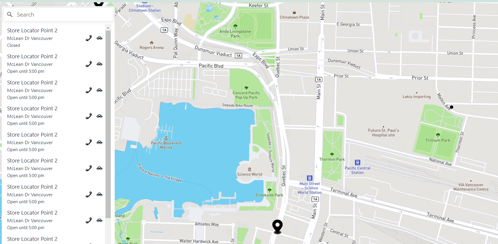
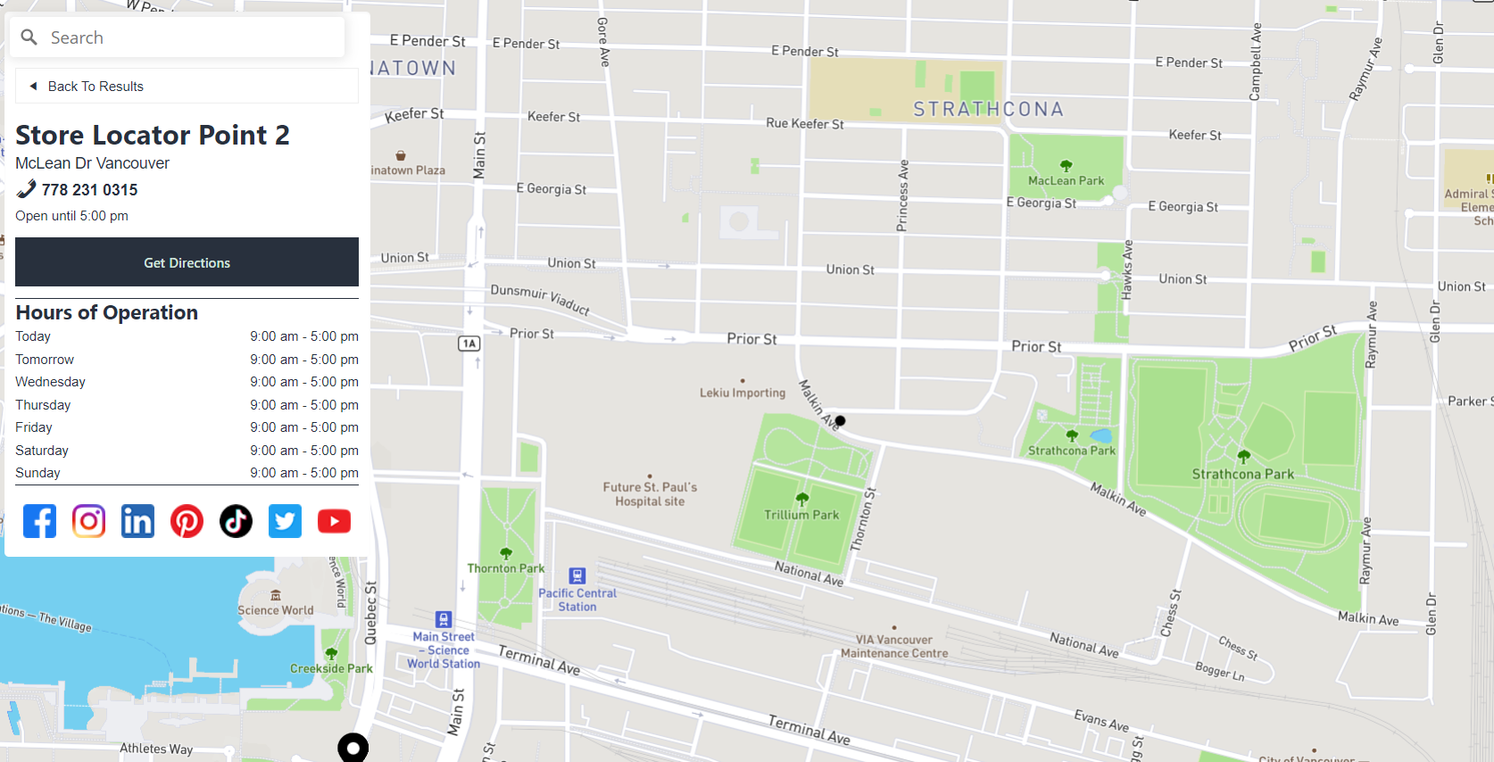
**Store Locator** Pro turns the list into a business-directory interface — each entry expands into a detail view with address, phone, hours, website, social links, and a "Get Directions" link.
* **Store Locator Enabled** — turns the mode on. You'll also need to fill in the store fields (address, phone, hours, socials, custom button) on each feature's own WordPress post — this data isn't entered in the Mapmaker itself. See the [Store Locator](https://github.com/mapstertech/mapster-wp-maps-docs/tree/main/v1/maps/lists/store-locator.md) guide for a walkthrough of setting up those fields.
* **Order Hours Using Current Day** — rotates the weekly hours list so today appears first, labeled "Today"/"Tomorrow" instead of always starting from Sunday.
Store Locator list view.
Store Locator detail view, opened by clicking an item in the list.
### Category Filter
Adds a toggleable list of your feature categories so visitors can show or hide groups of features on the map.
**Display**
* **Tool Position**
* **Toggle Display** — show each category as a switch or a checkbox.
* **Badge Display** — show a color swatch, an icon, or nothing beside each category label.
* **Show Parent Categories** Pro — when off, a parent category's own toggle is hidden and only its children remain interactive; the parent still displays as a group label.
* **Show Number of Features** Pro — appends the count of matching features to each category label.
* **Children Toggle Independent from Parent** Pro — when off (default), checking or unchecking a parent cascades to its children. When on, children toggle independently of their parent's state.
* **Accordion Layout** Pro — collapses parent categories into expandable rows, useful when you have many categories.
* **Add Reset Button** Pro — adds a button that restores every toggle to its initial state.
* **Render in External Container** Pro — renders the filter into a `
` elsewhere on your page instead of on the map.
**Behavior**
* **Toggle Functionality** Pro — for features assigned to more than one category: **Inclusive** (default) keeps a feature visible as long as at least one of its categories is still checked. **Exclusive** hides a feature the moment any one of its categories is unchecked.
* **Excluded Categories** Pro — hides specific categories from the filter list entirely (their features are unaffected — they just can't be toggled from this control).
* **Additional Filters** Pro — adds extra filter checkboxes driven by custom or ACF properties on your features, alongside the category tree.
> **Note:** Which categories are checked by default, and the display order of categories, aren't yet editable from the Mapmaker. Configure Initial Visibility, Preselected Categories, and Category Order from the classic editor's Filters section for now — see the [Category Filter](https://github.com/mapstertech/mapster-wp-maps-docs/tree/main/v1/maps/filters/category-filter.md) guide.
\[SCREENSHOT: Category Filter settings panel in the Mapmaker, showing the Display and Behavior accordions]
## Navigation & View
### Zoom
Adds zoom in/out buttons. On Mapbox and MapLibre this also includes a compass that snaps the map back to north when clicked. On Google Maps it's Google's own native zoom control. Enabled by default. Only setting: **Tool Position**.
### Scale
Adds a small translucent scale bar showing real-world distance at the current zoom level. Only setting: **Tool Position**.
### Fullscreen
Adds a button that expands the map to fill the browser window. Only setting: **Tool Position**.
### User Location
Displays the visitor's position on the map using the browser's Geolocation API — the browser will prompt for permission. This control requires HTTPS.
* **Tool Position**
* **Set User Location on Load** Pro — automatically triggers geolocation as soon as the map loads, instead of waiting for a click.
* **Follow User Movement** Pro — keeps the map centered on the user as their position updates, rather than a one-time locate.
* **Show User Direction** Pro — shows a heading indicator using device compass data (most effective on mobile). Turning this on also enables movement tracking.
* **Enable High Accuracy** Pro — requests GPS-level precision from the device. Slower to acquire and uses more battery.
* **Show Accuracy Circle** Pro — draws a circle around the user's position representing the margin of error.
These five options currently take effect on Mapbox and MapLibre only. On Google Maps, this tool is a simple locate-and-center button regardless of these settings.
### 3D Toggle Mapbox, MapLibre only
Adds a button that toggles the map between a flat top-down view and an angled 3D perspective — useful for making 3D polygons or 3D terrain visible. Only setting: **Tool Position**.
### Map Type Google Maps only
Adds Google's native control for switching between roadmap and satellite views. Only setting: **Tool Position**.
### Street View Google Maps only
Adds the Street View "pegman" that visitors can drag onto the map to drop into street-level imagery. Only setting: **Tool Position**.
## Map Style & Layers
### Map Style Toggle Pro, Mapbox/MapLibre only
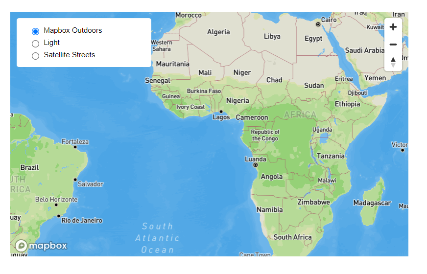
Adds a panel where visitors can switch between multiple map styles you define.
* **Tool Position**
* **Default Style Label** — the label shown for your map's own starting style in the list.
* **Styles** — an ordered, add/remove list of entries, each with a **Style Title** and either a **Style URL** (a Mapbox/MapLibre style URL) or pasted **Style JSON**. Remove line breaks from any pasted JSON first.
Map Style Toggle on the live map.
### Map Layers Toggle Pro, Mapbox/MapLibre only
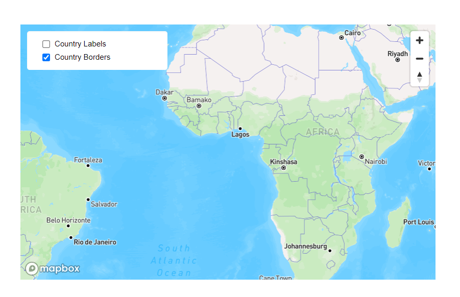
Adds a panel where visitors can show or hide named layers from your Mapbox Studio style or custom style JSON.
* **Tool Position**
* **Checkbox Type** — Checkbox or Switch allow multiple layer groups on at once; Radio allows only one at a time.
* **Layer Groups** — an add/remove list of groups. Each group has a **Layer Group Title** (the label shown to visitors) and its own list of **Layer ID** rows — one row per style layer to toggle together. Layer IDs must exactly match the layer names in your style; if any layer in a group can't be found, that group's toggle won't appear at all.
Map Layers Toggle on the live map.
## Data & Output
### Data Downloader Pro
Adds a button that lets visitors download the currently visible map features as a CSV file.
* **Tool Position**
* **Apply Filters to Download** — when on, features currently hidden by an active Category Filter are excluded from the download.
* **Notify Admins of Download** — sends an email to selected WordPress users whenever a download occurs, including which category filters were active at the time.
* **Included Columns in CSV** — an allow-list of column names to include; leave empty to include every column. Do a full download first to see the exact field names available, then enter the ones you want here.
### Print Pro, Mapbox/MapLibre only
Adds a button that exports the current map view as a PNG image of the on-screen map canvas. Only setting: **Tool Position**.
### Custom HTML Pro, Mapbox/MapLibre only
Places a box of fully custom HTML on the map — useful for a legend, a custom filter, or a decorative panel.
* **Tool Position**
* **Edit Custom HTML** — opens a code editor to write your HTML. Include a `